LinkedIn desktop redesign
DESIGN LEAD & MANAGER / HOMEPAGE AND FEED / LINKEDIN
DESIGN LEAD & MANAGER /
HOMEPAGE AND FEED / LINKEDIN
After launching the publishing platform and the Pulse app, member sentiment pointed towards integrating the content experience fully into LinkedIn. I transitioned to lead the redesign of homepage and feed on desktop and built out the foundations of the content ecosystem on LinkedIn.
The problem(s)
A recent company-wide shift to prioritize mobile products had left LinkedIn's desktop site outdated and inconsistent. Not only were we in dire need of a visual refresh, a period of hypergrowth had also resulted in building products in silos, making it nearly impossible to scale.
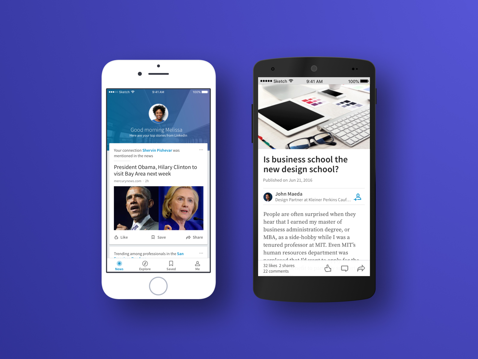
Desktop and mobile screens from the previous LinkedIn experience.
Cross-team collaboration
Due to the large-scale nature of this effort and an aggressive timeline, we adopted a unique approach to ensure we were partnering effectively both across teams and functions, while making user-centered design decisions each step of the way.
Life in the war room: stop motion video captured by one of our teammates.
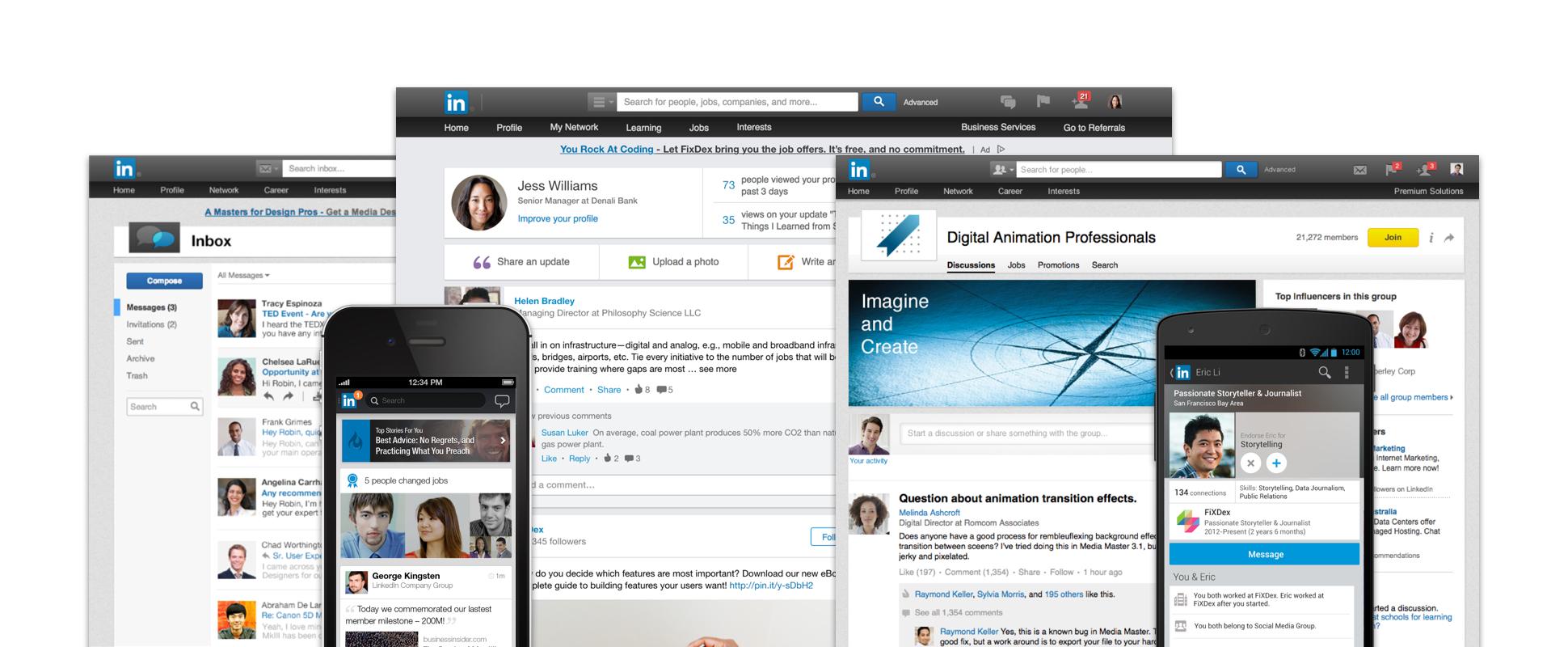
We adopted an "embrace and extend" principle when scaling up from mobile to desktop. This video shows how mobile scales to 2 and 3 column layouts on web.
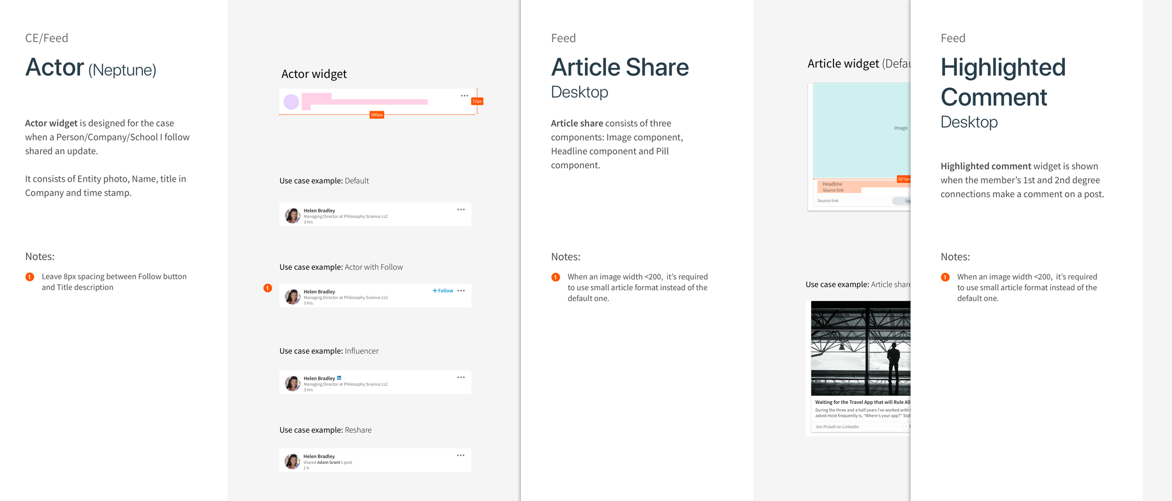
I partnered with engineering to design and build a modular design system for feed posts. These design guidelines enable other teams to quickly introduce new types of content into feed.
Conclusion
In the span of a year, we laid the groundwork for LinkedIn’s new desktop platform, establishing a new design system for a growing user base and making it easier for designers and developers to design, build and iterate much faster.
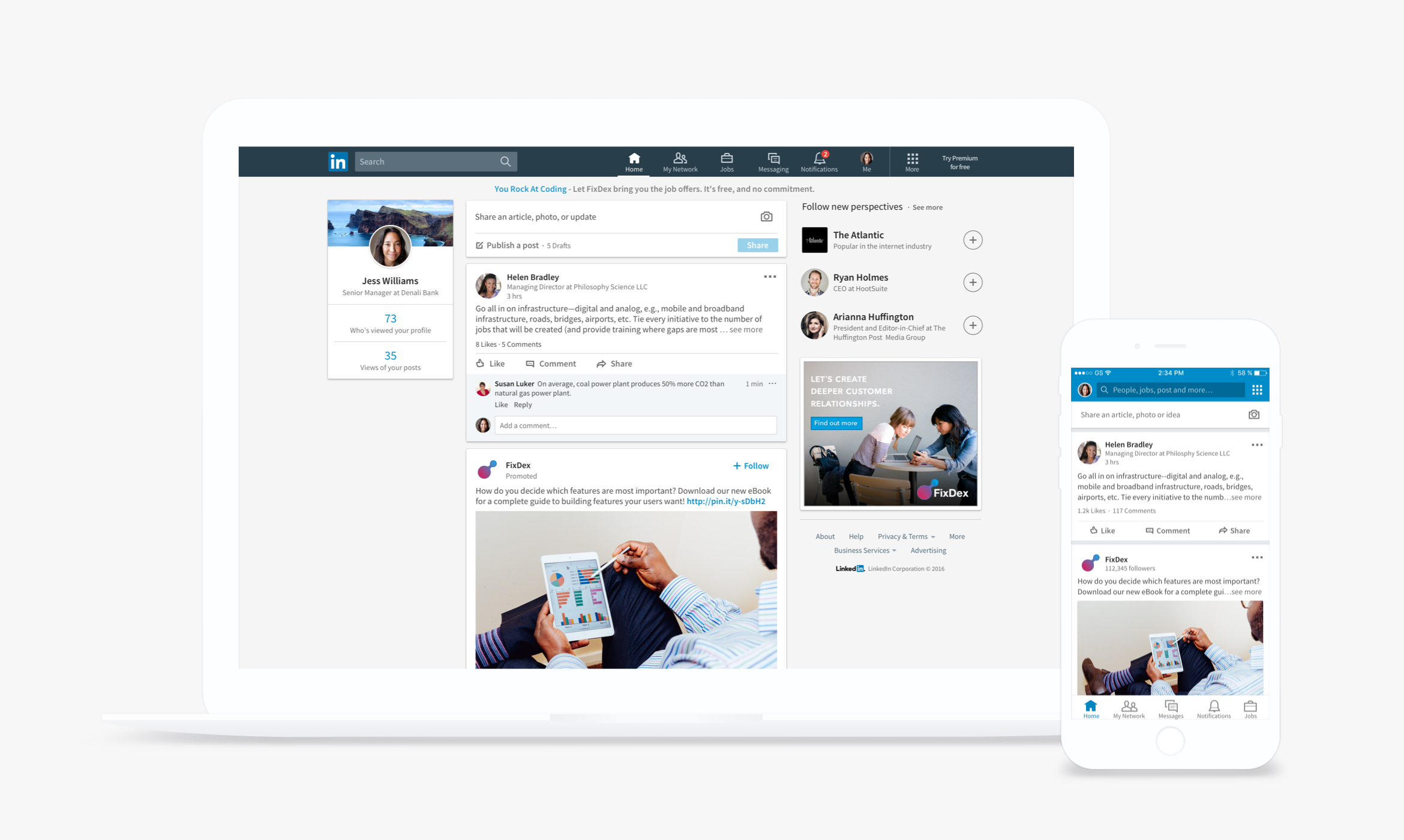
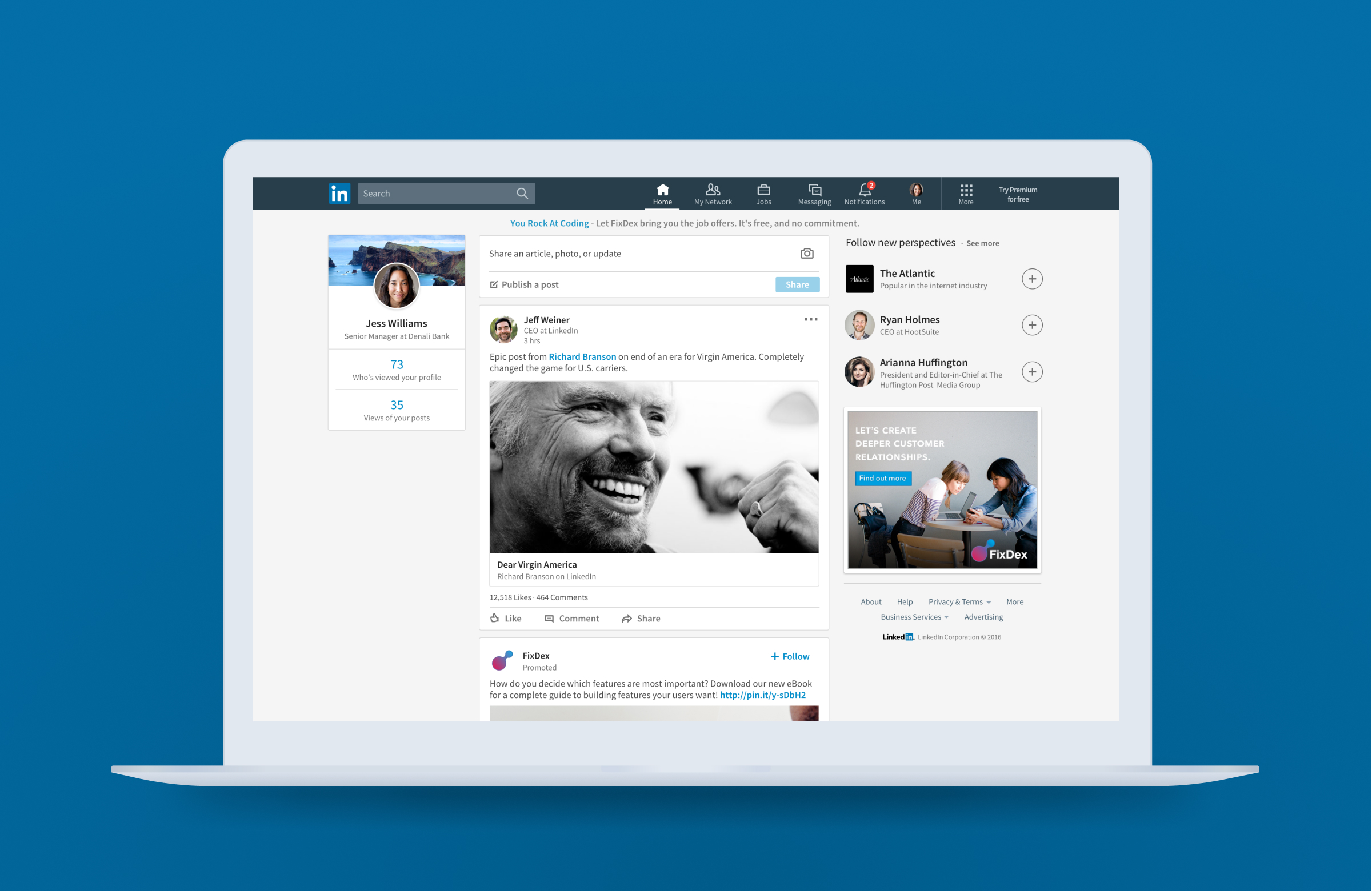
LinkedIn's new desktop platform brought parity with the mobile redesign.
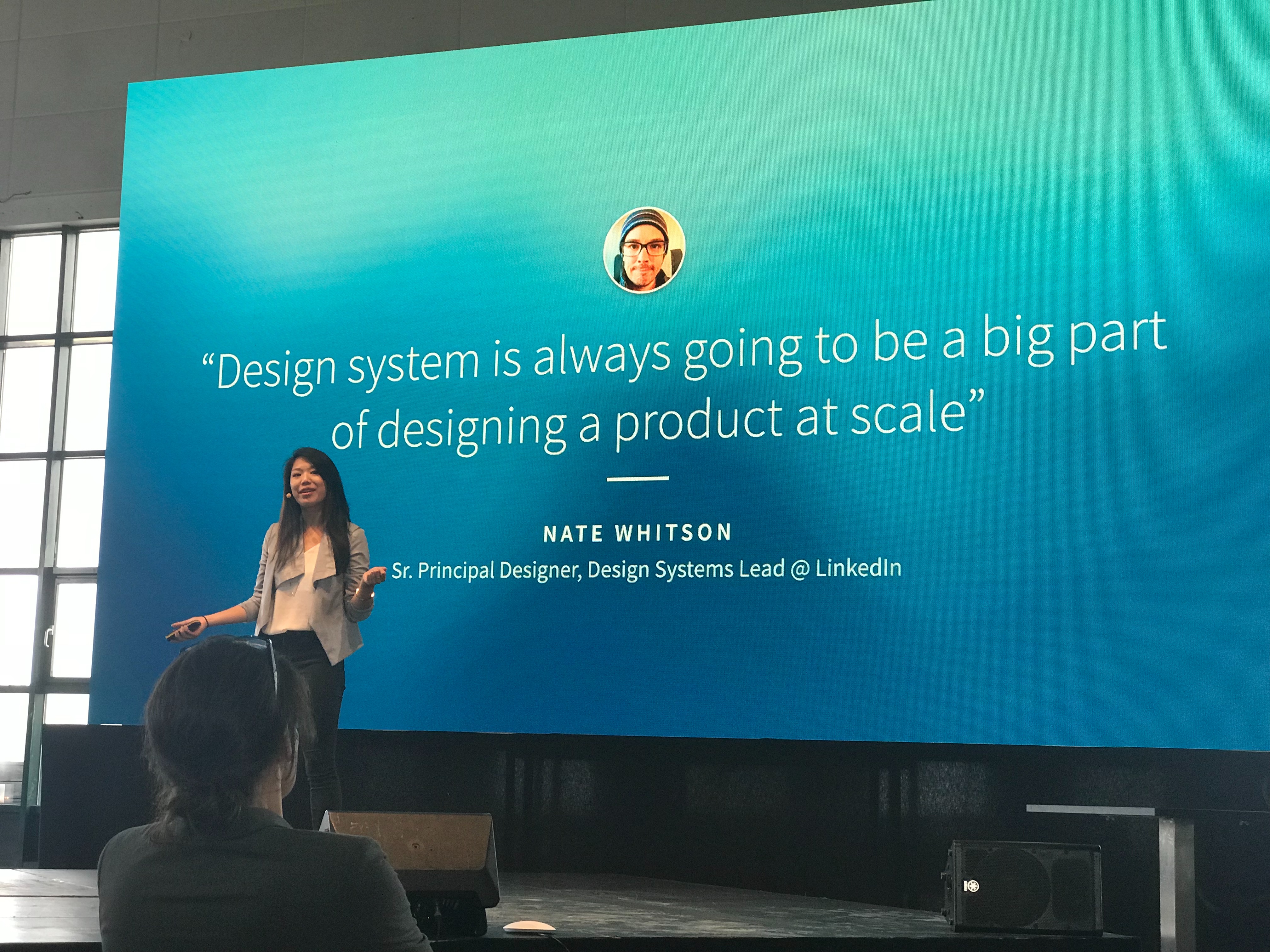
I had the opportunity to share our work and process at Design Matters 2017 in Copenhagen with one of my design partners, Maria Iu. Here's a link to the full talk.
I had the opportunity to share our work and process at Design Matters 2017 in Copenhagen with one of my design partners, Maria Iu. Link to full talk.
Other projects